Other

Website Changes/ Post E3

This week, I'd like to highlight some changes around the site!

You'll notice in the navigation bar that a few options are missing. They've been cleaned up and condensed into the current options. Please feel free to explore my updated portfolio. Over time I plan on adding additional projects I worked on, so check back regularly to see what's new.

Also, if I met you at E3 and we traded business cards then you should be expecting an email soon. It was a pleasure meeting so many talented developers. If I missed you, feel free to shoot me a greeting! 

Next week we'll be taking a look into Disney Magic Kingdoms. We'll talk about finding the fun and why I'm still playing it two months later.

I'll see you guys next week,

Scott
Gardens of Eden Update 3

I HAVE DEFEATED THE BUG!

Hello everyone! Welcome to the third update on Gardens of Eden. It’s good to be back off of hiatus and now for an update!

First off, and perhaps most importantly, the lighting bug has been fixed. If you’ll remember, I was having issues fixing a bug that involved the lighting building in UE4. In short, it just wouldn’t build. Instead, it would get stuck at 0% and never progress past it. The quick version of how to fix it is: in your Unreal Projects Folder, change the map name while making sure the editor and the launcher are closed. I also changed the project name here just for good measure.

On to the update!

Here is a more detailed walkthrough of the updates I implemented recently:

What’s going on in the octagon?


Well, I removed the spinning blocks. They just weren’t quite working. The quick spinning version looked… uncomfortable. And the slow spinning one didn’t actually contribute much of a challenge or reinforce the learned mechanics. So instead we now have a little bit wider jump. As you can see in the video, I have to get a bit of a running start before I can make it across. The area on the other side is also raised, so if a player falls in the river they will have no hope of escaping and will have to go with the tide.


As for the tower, I completed the stairs! What I mean by that is the jumps. The jumps get progressively more and more difficult without being too frustrating. For the first few times the player falls through the stairs, if they miss, they will land on the floor directly below them. This way they won’t get too discouraged and annoyed by being punished, and can try again quickly. The final jump though is larger and the player can fall down two floors if they mess it up, but it’s unlikely. For more info on how this works please enjoy my video. Additionally, the player can jump into the crack in the wall and use that as a middle ground to go to the next set of steps.

The temporary lighting in it just makes me think about the future, like how I’m going to create torches to light the player’s way. I’ve got to finish up some of the terrain, the rivers need to flow somewhere, add collision to the walls, and add in the tree and river. Soon we’ll start beautifying the area.

Next week we’ll talk about something more mobile game centric. I’ll see you then!

Scott

Return of the Designer

Well that was a nice relaxing vacation. Batteries are back at full charge! I hope you're ready, you've got a lot of new content coming you way over the next few months. Starting next week with the much awaited and promised update on Garden's of Eden!

I'll see you guys next week,

Scott
Character Design First Impressions: Dory's Parents

This week I want to take a look at the design of Dory’s parents. More specifically, what identifiers tell them apart? How can you tell they are male or female? And why might this be important?

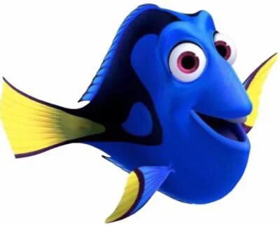
In case you live under a rock, Dory is a character from Finding Nemo. She’s a fish with a terrible memory. She literally forgets things within seconds of learning them. I guess you could say… she has a goldfish memory. **BA DUM CHEE**

Okay that was pretty bad, MOVING ON!

In the new movie, Finding Dory, she’s attempting to find her parents.

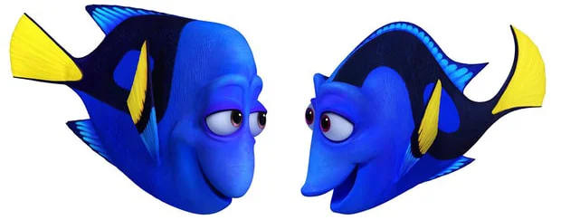
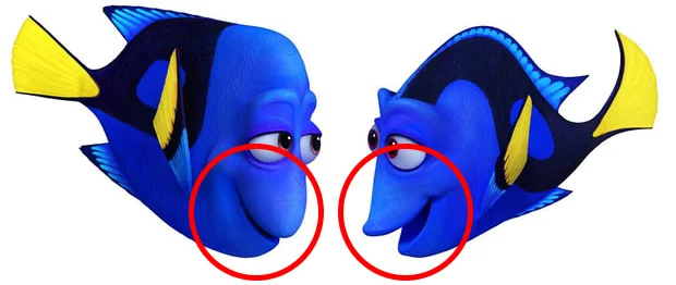
Now I want you to take a look at this picture. Without any other information, tell me what you notice about the picture. Who do you think the father is? Who do you think the mother is? Why?

Really take a look at them:

Okay. The one on the left is the father. On the right is Dory’s mother. You probably were able to figure this out on your own. What identifiers do you see? Let’s work this one out:

What I noticed:

·      Size – While in other species of animals the female is frequently larger, because this movie is created for humans, the male is larger. This is because most humans see males as being large and females as petite. This is what we’re used to because men are typically portrayed as bigger than women in most media. Hence why the mother looks to be the smaller of the two.

·      Curves and angles – If you take a good look at the two, the mother has a larger curve on her back. This curvier feel is something that is typically associated in society with the fairer sex. The father is much more blocky, his shape almost looks like a square.

DorysPArents4.jpg

o   The top/bottom fins & tail fins - If you look at the mother’s fins, you’ll notice they curve more. The tail and the top fins all have a more pronounced curve than the father’s. His fins look very plain and straight. This can also be seen in other male characters as well. Because females in human society tend to be shown with larger hips and more curves, we will typically see straighter lines across male characters.

o   The nose – The nose adds to each character’s curves and overall look. The father has a rounder nose, which is pointed downward, not breaking up his square-like shape. The mother on the other hand, has a nose that curves out. Like in the previous point, this adds to her curved look.

o   Mouth positioning – If we look at how the two have their mouths positioned in this image, we’ll see that the way they open is slightly different.  Due to the noses, it looks as if the mother’s mouth protrudes just a bit more, giving an appearance of lips. The father’s mouth is restricted due to the shape of his nose to reinforce his box look.

Now, there is one more major difference, which is my personal favorite because it blows my mind. When you think of middle or older aged man’s appearance, what comes to mind? Specifically dads.

Side note: This is something that is specific to this particular character, but I found it to be so interesting that I thought I should point it out.

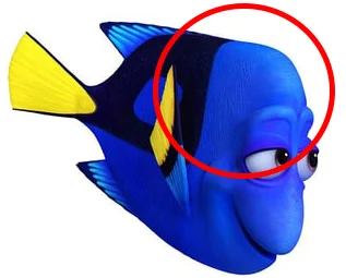
While there are a variety of hairstyles, the receding hairline is an easy tell of a man’s age. Just like Dory’s dad!

Wait. Fish don’t have hair! At least not like us!

Very true, but look at what the geniuses at Pixar did!

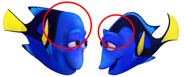
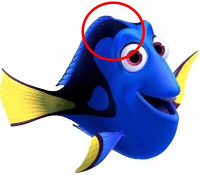
Using the colors of his fish scales, they have successfully created a receding hairline. Compare him to his wife and Dory, and you'll see that the two female characters have a dark pattern on the top of their head as well, but theirs reaches their eyes and travels along their back. This is much like women having long hair in the human world. But they did it on a fish.

This just blew my mind when I noticed it, and I thought it would be great to share.

Not convinced?

Here are a couple other examples we see from Disney and Pixar films:

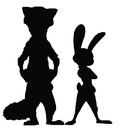
In this silhouette there are two characters. One is the male and one is the female. Just by looking at their shapes, which one do you think is which sex?

If you said the taller one is male and the shorter one is female, then you guessed right!

The two characters are Nick Wilde and Officer Judy Hopps.

What are some of the similarities between these two sets of characters?

Size and overall curves amongst the characters are the two, which stand out the most. If we look at Nick’s profile, he seems much more boxy with a thicker neck and, due to his shirt, a more straight lined look overall.

Officer Hopps on the other hand is very curvy, much like how women typically are when compared to men. These identifiers already tell you a little about the character.

Here are a few other characters across a variety of animated films, and their overall shapes highlighted.

 Side note: While we see this trend fairly frequently, there are a couple exceptions. If the character is overweight, then both sexes lean towards being just round. And if the character is a youth, as children typically do not have these traits, as these identifiers don’t set in until puberty.

Here’s a shot of Judy’s parents, Stu and Bonnie Hopps. We can see the mother has more curves than the father. He seems more boxy.

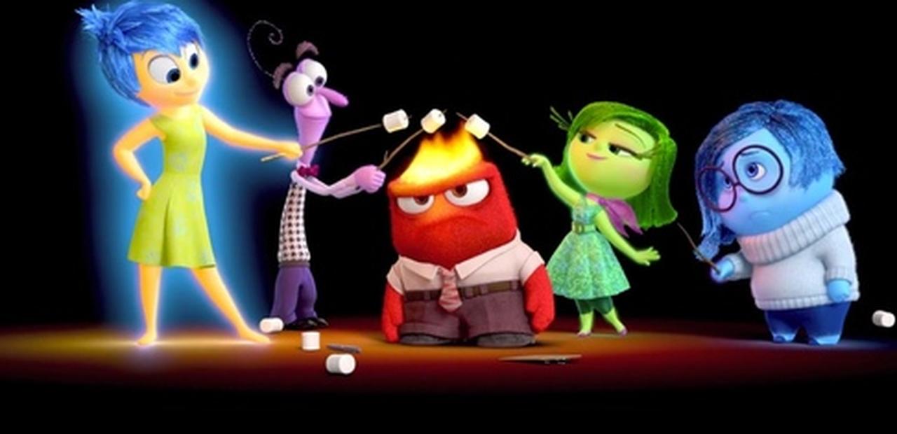
From left to right: Joy, Fear, Anger, Disgust and Sadness.

Joy and Disgust are both curvier looking than Fear and Anger. Sadness on the other hand is overweight so she appears more rounded.

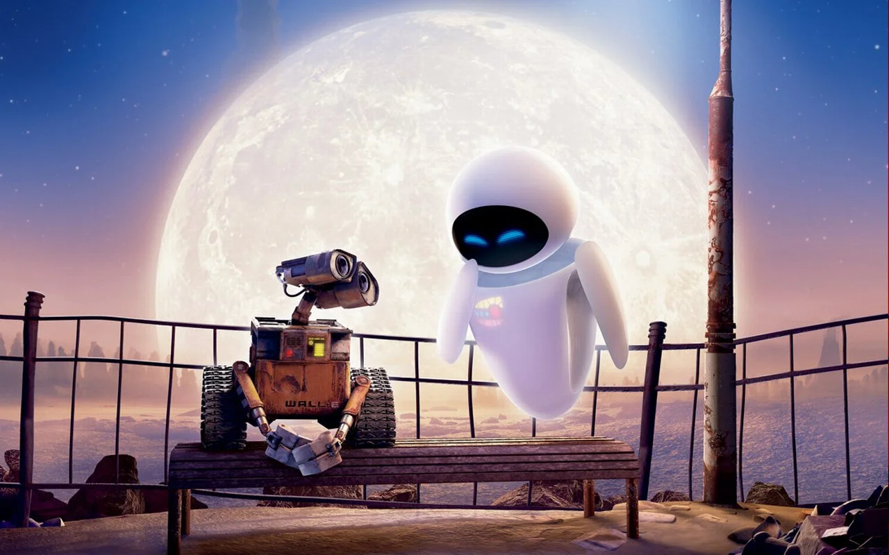
Wall-E and Eva. Literally a box and a nice smooth curve.

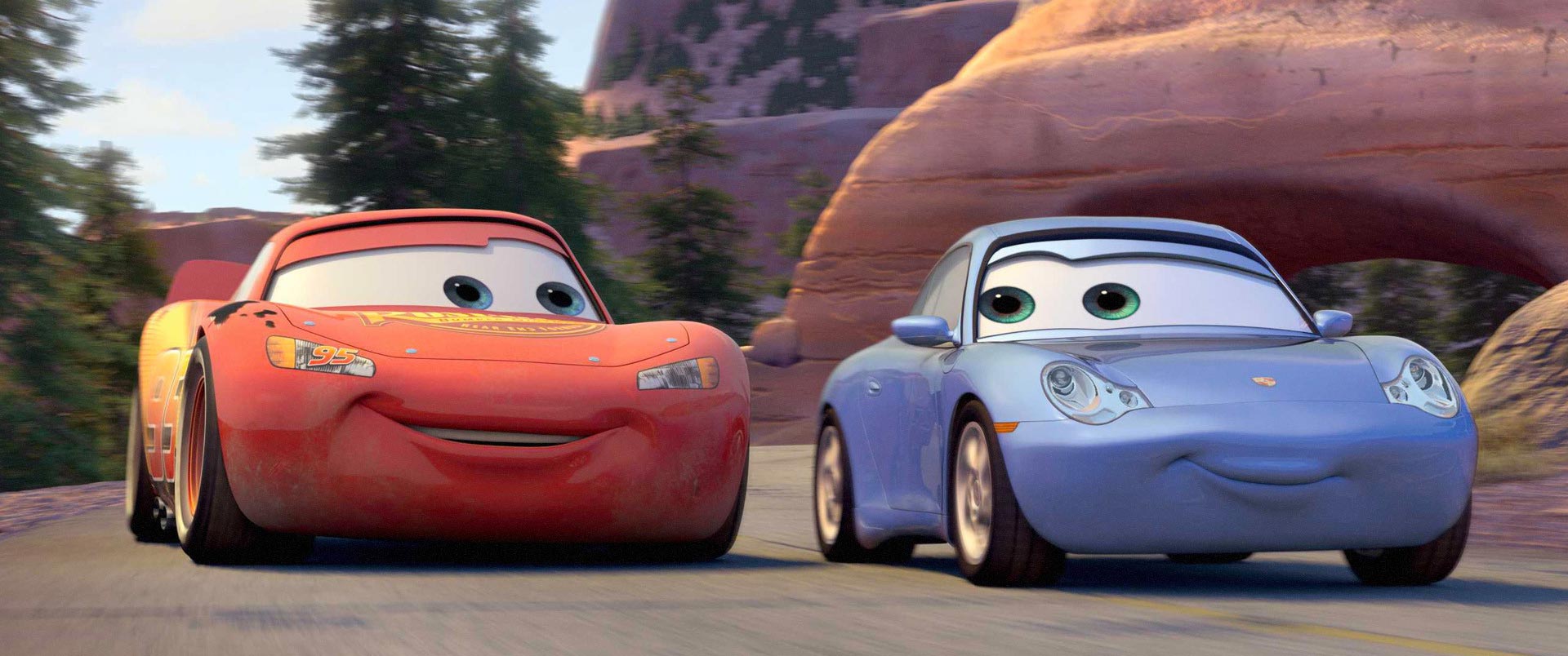
Lightning McQueen is boxier with his raised fenders and he seems actually wider, contributing to his overall size.

Mike and Sully have considerable girth over Celia. Sully is a box and mike is round, where as Celia has a variety of curves.

You get the picture.

Wait, so all characters need to have these identifiers?

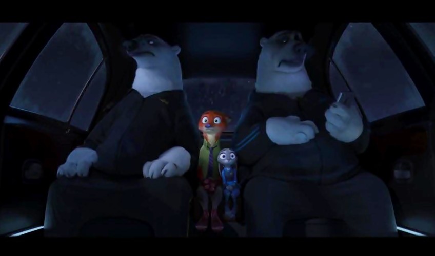
Not necessarily, it’s just helpful when trying to distinguish the most basic aspects of a character. That, and by having characters which have elements which are shared with humans, it makes us more comfortable and easier to relate to them. For example, the polar bears in Zootopia. It seems like they are not characters that the creators felt like they needed to be related to as much as Judy and Nick. Instead, both sexes needed to appear intimidating and powerful. This is why we see that the female polar bear, seen in the police academy boot camp scenes, and the male polar bears, seen with Mr. Big in the mob boss scenes, look almost exactly the same. In that case, the sex of the character doesn’t matter as much to the story.

Side note: Though I was a little confused by the female polar bear not appearing to have any differences than the males initially, I think this is because I was expecting the female character to be a male character due to the overall shape and sheer size. Though the female and males were never shown together, there are other tricks that are used to make the males seem larger. In most, if not all, of the shots with the female, she is outdoors with a lot of space around her. The males on the other hand are almost always shown indoors, with their heads nearly touching the roof, having to duck through doors, and being in scenes with much smaller animals.

Sorry I couldn’t find a picture of the female polar bear. When the movie comes out on Blu-ray I’ll update this to reflect images of her as well.

With all that said, you don’t have to create your characters like these. These are just a few things I’ve noticed that stretch across quite a few movies. Honestly, I can’t wait to see how the community takes these ideas and flips them on their head to help make characters more relatable to an even wider audience.

What did I miss? I know there are probably other elements, which you might have noticed but I didn’t. Feel free to comment them below so we can continue to analyze Disney and Pixar’s character designs. What do you think Dory’s parents will be like? I’d love to continue the conversation.

Next time I’ll be posting an update on my personal project Gardens of Eden. Can I figure out the lighting bug, which has been plaguing me? Will I be able to add collision to all the pieces that don’t have it? Stay tuned next week to find out!

I’ll see you guys next time,

Scott

If you enjoyed this post, you’ll enjoy Signposted my game design focused newsletter. You can sign up here: https://signposted.beehiiv.com/subscribe

P.S. For reading the whole thing I think you deserve some Pixar goodness. Here’s the Finding Dory trailer. Enjoy!

Gardens of Eden Update #2

Well, I got caught up on a bug, which is a little embarrassing, but let’s focus on the positive for now!

This week, I spent a little bit of time just setting up the project. Using the First person shooter Template, I created a small field, and started blocking out some of the area. My first goal was to set up the tower. Initially, I set up a giant cylinder. I wanted to check the size and how far I could see into the distance. Because a big part of my game is based on this first view of the world, I wanted to make sure the player could see far enough to be enticed to explore.

Just a lonely hollowed out tower. If you’ll notice I have the player view in the window on the bottom right.

The next step was building the walls around the tower. I wanted to make sure the distance between the tower and the wall didn’t feel claustrophobic, so I modeled that around the size of the tower. I ran a few times through the area just to make sure the distance didn’t feel too far away or too close. After much tweaking, I think I found a happy medium.

I hid the tower so you can get a good look at the steps. I adjusted the player's jumping ability to make sure they can make it over the blocks and later for the steps as well. A lot of testing is going into the feel of movement because, being the most used mechanic, it needs to feel amazing. 

Next, I wanted to model some stairs for the tower. Since I am just blocking things out at the moment, I decided to use the spiral staircase within UE4 for now. I’ve played a little bit with it to get a good feel for it, and started adding in the different jumps the player will have to experience throughout the stairway climb.

Here’s a shot of all three pieces separated.

This is where it began to get a little tricky because I ran into an interesting bug. The lighting won’t build. For whatever reason the lighting won’t show up on the things that should be lit. This isn’t a new issue. It just isn’t something I’ve had to deal with for a long time. So, I made a mistake and spent too much time focusing on trying to fix it because I found it incredibly difficult to test the stairs without lighting.

Here’s a shot of the pieces combined. Unfortunately, it looks weird because of the lighting isn’t building. Also the ones here are static meshes I created instead of BSP brushes like in the previous images.

So that’s pretty much it for this week. Next time I post an update for Garden of Eden, I hope to have the forest filled out a little bit, as well as get the water around the tower put in. I also hope to have the stairs put into the tower and have the spinning blocks included as well.

Next week, we’re going to be spending some time looking into the character design for a certain forgetful fish’s parents. The week after that will be the next Gardens of Eden update, and the week after I’ll be taking a look at Gameloft’s Disney Magic Kingdoms.

See you next week,


Scott